- About Face
- Ad
- Adios Barbie
- Adipositivity
- Beautiful Women Project
- Body (I)con
- Body Positive
- Council on Size & Weight Discrimination
- Eating Disorders, Disordered Culture
- Fat Acceptance Stuff
- Fat Rights Coalition
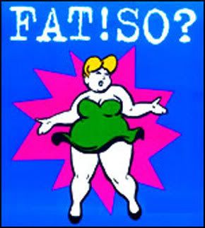
- Fat! So?
- International Size Acceptance Association
- Kelly Bliss
- Largely Positive
- Largesse
- Love Your Body Day
- NAAFA
- NEDA
- Reflecting Venus
- Size Wise
- This is Beautiful
- VoluptuArt

Fat-Positive Websites

Fatosphere
Beth Ditto!

Fat-Positive Music

Sunday, March 8, 2009
Kelly Bliss
I think this website had an okay idea, but was overall, a disaster. This website looked extremely dated. It seemed as though it had not been updated since the 1990's. In addition, it was too crowded. It was hard to navigate because there were SO MANY links. I did not like how this website had a large focus on selling a product. If this website was truly about the well-being of others, than I think they should consider condensing the sale part of it. The very first thing I saw on the web page was a sales pitch for a workout video.
Subscribe to:
Post Comments (Atom)


No comments:
Post a Comment